2 notes
Opera Salvage
Evan Calder Williams talks of salvagepunk – “a return to the repressed idiosyncrasy of outmoded things”.
By (sic) opposition to postmodern pastiche, in which any sign can be juxtaposed with any other in a friction-free space, salvagepunk retains the specificity of cultural objects, even as it bolts them together into new assemblages. That’s precisely because salvagepunk is dealing with objects rather than signs
– Mark Fisher: Desecration Row, in The Wire 319, page 46
The Wire magazine, ear to the grounds of crit-think and artistic practice both, has astutely flagged salvagepunk as informing a breaking musical microtrend.
We predict that salvagepunk will break out of this music context, to become a key aesthetic for a new stage of post-postmodernism. The affordances of the internet will enable this to happen. That the first works informed by salvagepunk are musical is, we conject, due to music’s status as the popular art form access to the historical corpus of which has been most transformed by the internet. Other media, particularly time-based, will follow.
Here’s our thinking.
Kenny Goldsmith wrote of nude media – digitised content stripped of context. But: a denuded copy of a familiar song gives itself away by the patina of experience we individually and collectively attach to its content; still evokes time and place; is loaded with signs, a wingful of eyes.
For nude media to become amenable to salvage, there’s a harsher stripping-bare to be undertaken than that of which Goldsmith writes, subsequent to which salvage operations proper can begin – the calcination and burning off of, or turning-aside-from all signification, to locate the object as object, song as sound, form not even form, but shape.
Time can serve that function – the glories of the forgotten whitelabel in the dusty crate at Dalston Oxfam testify to that; but cultural Time is driven by the fidget wheels of Progress. There’s a gradient to cultural Time; the suck towards that compressive depth into which most of everything made, sinks, lost to salvage deep under the midden-heap of consumer culture disjecta.
The internet not only flattens that gradient, thus making findable nude media from everywhen; but often presents such already de-signified and in gorgeously ambiguous contextual conjunction.
If postmodernist aesthetics led to “everything the second time around, without the innocence”, salvagepunk perhaps points to the field of possibilities opened up to those who avail themselves of internet-mediated access to “everything around, still, forever, without the memories”. Not an overloaded gluing-together of the familiar, but a reconsideration of the utility for assemblages of everything – of a kind which can only be possible when everything is always to hand.
So, all that aside, what does salvagepunky music sound like? Contemporary works incorporating elements of Chris de Burgh’s Lady in Red are cited amongst Wire’s examples. But to our ears, cosmic disco god Daniele Baldelli’s 80s mixtapes are the exemplars of the salvagepunk aesthetic – mixing the cool and uncool, the obscure and the overfamiliar, into a free-floating sound-world of disco delight. Hunt those tapes down down online (not too hard a task), lean back and enjoy the sounds of Opera Salvage.
0 notes
The Wisdom of Edward Tufte
The legendary information design theorist (and advisor to the Obama administration) is in London to promote his latest tome, Beautiful Evidence. We were lucky enough to get tickets for his talk at the Royal Geographical Society (along with apparently most of London’s geek population - talk about preaching to the converted).
Others have already transcribed his talk much better than we could have done, so we’ll stick to a few salient points. [Note: this is *very* hacked down for pertinence to this blog, hence the links to fuller notes and the full presentation at the bottom of the post].
Tufte on design …
The essential test of design is how well it assists the understanding of the content, not how stylish it is. You must understand the meaning of the content to design it. ‘Content indifference’ is the result of teaching that only design matters … Content matters! It’s a shame we live in a world where that counts as an insight.
On presenting and presentations …
There are two things you need to get across in a presentation - what the story is and why the audience should believe you.
On web design …
91 percent of pixels on the screen should be information.
On data visualisation …
It’s not a surface, it’s a depth.
At the end of the talk, we plucked up the courage to ask the great man a question. Asked what he thought about the current vogue for artists interpreting data with animations and so on, Tufte said, 'I think they can do exactly what they please … one reason it’s alright is they’re not making other claims about the content, just using it as a found object. … I’ll stick with Matisse.’
Note: Lucy Spence’s brilliant sketch notes of the talk are on flickr whilst Intelligence Squared - who hosted the event - have a pay-per-view stream.
0 notes
0 notes
Social News
One of the main findings is that, like everything else in internet-enabled nations, news is now social. Pew’s research found that Americans are increasingly active participants in online news creation and dissemination, as well as keen consumers of mobile news content. For example:
- 37% of internet users have contributed to the creation of news, commented about it, or disseminated it via postings on social media sites like Facebook or Twitter.
- more than 8 in 10 online news consumers get or share links in emails.
- a third of cellphone users access news on their phones.
Locked down, pay-walled content is more or less shut out of this conversation – after all, how many ‘subscription required’ links have you forwarded to your mates or colleagues lately or posted to Facebook? Worse still, the research further reveals that only 17% of Americans read news in a national newspaper on a typical day. So, as physical newspaper reading wanes, many newspaper companies are actively shutting themselves out of the online ecosystem by pursuing a pay-per-view or subscription model. Smart.People’s experience of news, especially on the internet, is becoming a shared social experience as people swap links in emails, post news stories on their social networking site feeds, highlight news stories in their Tweets, and haggle over the meaning of events in discussion threads.
1 note
Kinetica Art Fair 2010
 Here at BST we have a ‘kid test’. If kids immediately 'get’ a piece of interactive art and are engaged with it, then that’s a clear indicator of the effectiveness of the piece. Of course, all art is subjective, but interactive and new media art in particular can suffer from a degree of convolution and – to be frank – irrelevance. The kid test filters a lot of that out. One parent was overheard patiently explaining to their daughter that 'not everything moves’, but if the art fair is called 'Kinetica’ that’s a fair expectation.
There are lots of pieces which pass the kid test at this year’s Kinetica art fair at P3 in Marylebone. Special props go to Squidsoup’s Ocean of Light, a startlingly beautiful 'dynamic light sculpture’ that reacts to music. We can see all kinds of amazing artistic and commercial applications for this piece, not least in live performance. Bjork, get in touch! Cinimod Studio’s Flutter which produces a rabble of virtual butterflies is also charming and effective – a real example of how digital art can be humanised. On the more Dorkbot-esque side of things, Monomatic’s P.E.A.L. replicates bell ringing with tubes of light, lasers and a iPhone remote (note, expect to see A LOT more iPhone remote controlled applications).

The fair also has some neat examples of first generation hacker art, such as Miss Rosa Bosom, a robot created by Bruce Lacey which won the Alternative Miss World in 1985 and SAM, a sound reactive cybernetic sculpture from 1968 by the late Edward Ihnatowicz. As an argument for the continued importance and relevance of digital and electronic art (are you listening, ICA?), Kinetica 2010 makes a pretty compelling case.
0 notes
Christmas at Number 42
Click to play slideshow.“I had a childhood fantasy of having a tea shop with mismatched cups” – Tony Hornecker
[Photos © 2009 Darrell Berry]
0 notes
Introducing Fire & Knives
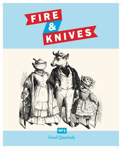
BST: What is the concept behind Fire & Knives?
TIM HAYWARD: Mainstream food media have become immensely ‘lifestyle’. I knew loads of food writers who just couldn’t get longer form, intelligently written pieces commissioned anymore. I also knew, through social media, hundreds of food lovers who couldn’t find anything interesting to read anymore.
Pulling it together – particularly using digital printing, a distributed 'zine’-style production team and using social media to build audience – was pretty much a no-brainer. That’s as high a concept as I can give you.
How is Fire & Knives different from mainstream foodie fayre such as Observer Food Monthly?
The traditional food magazines rely entirely on advertising. They will increase (or at least try to maintain) revenue if they can expand their audience from a special interest group to those with a marginal interest or, indeed, those attracted to celebrities and their opinions on food.
The result is an unavoidable dumbing down and celebrity focus. It’s now too late for any of those mags to go to a subscription funded model. With no advertising, our subscriptions pay for the printing and production. We don’t have to worry about how wide our audience is or their demographics – it’s only advertising that requires that. The magazine is as big as the audience want it to be. So we’re really growing, building and attracting an audience rather than seeking one out and attempting to address it. It’s the opposite of 'focus-group’ thinking and that has to be the first time that’s happened in years.
Why start a food magazine, particularly now when magazines are closing down?
I think the magazine world is in uproar because the model of a mag involves 20 staff, an office, advertising revenue to pay them and a marketing function to attract both advertisers and audience. There’s no other way – until you look at 'zine world and realise there are kids putting together creditable magazines with pocket change. The way Big Mags are heading now they are inevitably leaving behind a valuable audience and talented writers.
Can you explain a bit about Fire & Knives’ distinctive design?
Rob Lowe. Rob worked on Sleaze Nation and combines design and illustration skills with years of magazine experience. Rob and Cathy Olmedillas formPresent Joyswho are responsible for the design. I gave him an odd brief – all my favourites for the last year fromffffound.comstuck into an apple-printed booklet – and asked him to make something of it. The result is superb. He hit it on the button first time. That logo would have looked great on a government information pamphlet in the 40’s, on a packet of cheap Canadian bacon in the '70’s and it looks fantastic on a T–shirt today.
What are the criteria for contributors?
We’re looking for new writers who may not have been in print before, for established writers with a story they can’t sell elsewhere and for writers in other fields who might bring a new perspective to food. Most importantly we’re looking for the tonality of the true 'amateur’ – in the sense of 'one who loves’ food – rather than a connnoisseur or 'one who knows’. I guess the other important thing is that we are interested in British food. We are getting in touch with our own food culture now and it’s time we stood by it. Finally… no recipes or celebrity stories – others do that better.
Are there plans beyond a printed magazine? Or is the intention to keep it simple and focused?
Print only. All the way. We can build fame online but we can only establish value for the written word and the photograph, in print. The brand might expand into other things but the mag stays in print forever.
As a blogger yourself, do you think that there is a revival in writing for passion rather than purely profit?
I’m certainly finding that writers now – both the the new writers who’ve come through new media, blogging and the like and the traditional writers who get what’s going on – are aware of the importance of their personal brand. It’s great getting paid to write but if unpaid media are the only place to show your potential then you need to balance both. I regard our writers as a key audience too. They need to know they are being showcased at their best. We make sure their stories look great and are circulated to a list of influential people with commissioning power.
Of what other trends do you think Fire & Knives is representative?
I guess a growing confidence in British food culture, a revival in specialist print publishing, media properties that grow online but monetise offline and a trend for creatives taking control of their medium and speaking directly to an audience they know.
We at BST are delighted to have contributed a photo story about legendary pop-up restaurant The Pale Blue Door for the first issue. Fire & Knives is available via subscription from fireandknives.com. Article pitches should be sent to submissions[at]fireandknives[dot]com
0 notes
BigShinyThing recommends… Regretsy
- Accessories
- Age Inappropriate
- Annoying Descriptions
- Art
- Baby
- Bad Poetry
- Bathroom
- Cats
- Clocks and Watches
- Clothing
- Copyright Infringements
- Dead Things
- Decor
- Decorative Pillows
- Dolls
- Edible
- Fairies
- Garbage
- Garden and Outdoor
- Glassware
- Hats
- Holidays
- Jewelry
- Jews
- Kitchen
- Mailbag
- Michael Jackson
- Needlework
- News
- Not Remotely Handmade
- Paper Goods
- Penises
- Pet Humiliation
- Regretsy Math
- Self-Gratification
- Soap
- Spelling Issues
- Toys
- Twilight
- Vaginas
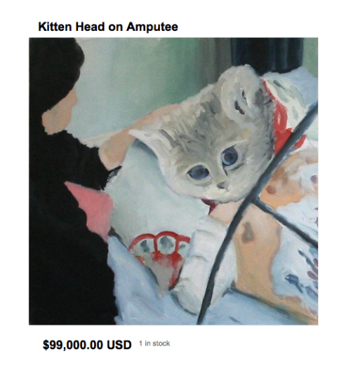
Pictured: Kitten Head on Amputee painting. Yours for a mere $99,000 and – bizarrely – still available.
0 notes
Chalkbot vs StreetWriter. A Nike Fail?
The marketing and communications industry often find its inspiration through outreach to ‘edgy’, street or political artists. Think Barbara Kruger’s work with Selfridges, or street artist Speto’s posters for Brahma beer. At the occasional cost of some credibility points, everybody wins: artists get funding and exposure, brands get cooler creative executions than agency 'creative’ teams could dream up unaided.
But sometimes, ideas are appropriated for campaigns without the consent of their creators. Consent can, at first glance, seem a particularly grey area for street art, say, or activist content. After all, if you’ve gifted an idea to the commons without a clearly-stated and enforceable license in place, what right have you to complain if that idea gets spotted by an agency and used to sell, say, soft drinks. Or indeed, sports shoes?
Consider, for example, Chalkbot – a robot which writes messages in chalk on the road as it bumps along behind another vehicle. You can send Chalkbot tweets, you can text it, you can probably email it. And whatever you send, ends up on the road, writ large in chalk. Chalkbot is cool. Geek cool. As we understand it, Chalkbot was developed by DeepLocal, and, via ad agency Wieden + Kennedy, is being used by Nike as part of its brand tie-up with the LIVESTRONG campaign of the Lance Armstrong Foundation, at the Tour de France (yes this can get confusing).
We first heard about Chalkbot on Twitter today. But actually, no – we didn’t first hear of it today. We first saw the technology demonstrated a few years back, at a Dorkbot event in London. The project was called StreetWriter, and its creators were a group of highly technical activists called the Institute for Applied Autonomy (IAA). Not just cool, StreetWriter was also political. Watch the video.
Chalkbot isn’t StreetWriter. Although based on IAA’s work, Chalkbot is far from political. It’s commercial. It’s also built, in part, by former IAA members. Nothing wrong with that in itself. DeepLocal present their version of its history on their website [thanks to Nathan at DeepLocal for providing us with that link in response to my earlier shoutout on Twitter].
Crucially, however, Nike and W+K’s press releases apparently make no mention of their robot’s activist ancestry.
Our problem with that? One word: Attribution – a key concern of us commons-loving content-creators. Play, mix, mash-up, create using what we’ve made, but give credit where credit’s due: show respect to those who came before, on whose ideas you build. This is simple: even leaving aside the politics, Nike should be putting some more love out. It seems the IAA shares our views on this. In the past hour or so, they’ve issued a press release which details their dissatisfaction with Nike’s appropriation of their work. Read it. Respond as you see fit.
This story is developing. We’ll keep you posted as and when Nike or its agencies make any public response.
1 note
Face On
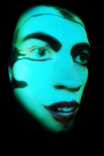
The installation is the product of Hear Colours who worked with a number of different artists to produce the work. We spoke to one of them, avant garde artist Patrycja Grimm.
BST: How did your involvement in Face On come about?
PATRYCJA: I got involved in the project through a friend who recommended me as I was often in an audio visual environment and would wear colourful faces and costumes on a daily basis.
I use my face as an alternative surface on which to paint; I experiment with colors, shapes, decorative writing and tagging the skin. Through this I’m looking for a more graphical way of reflecting my own personal being away from the traditional use of beauty make up.
As I grew more experienced I found people’s response to my self-expressed exhibition very positive, and this soon lead me to be invited into professional collaborations like the Face On project with Nicola Romanini.
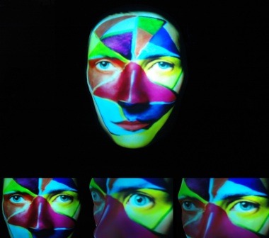
The aim was to create animation with expandin face-paintings and also capture facial expressions to use as samples for each of the sensors that the public will activate. With Nic’s agreement my proposal was to implement tribal designs from Kabuki, the Congo, Kathakali, and Papua New Guinea – as these are disappearing arts, along with more contemporary face-paints – such as clowns, pierrot, and some modifications with free-styling. It was a great opportunity to combine my need to paint with video art and interactive installation.
With these designs I wanted to reflect the subjects impression, aura, as well as their natural qualities and energies.
The project is visually stunning, but what – other than spectacle – do you hope people will take away from it?
From my personal point of view, I think Face On has good potential for interactivity which brings about a great joy of discovery.
As well as making people perform, The Mask brings a relaxed confidence about their own image which can now be used as a canvas for a visual game and hopefully reflection on our appearance in the era of absolute conformism.
Face On will be at the Glastonbury Festival 26-28th June and Glade Festival 16-19th July.
